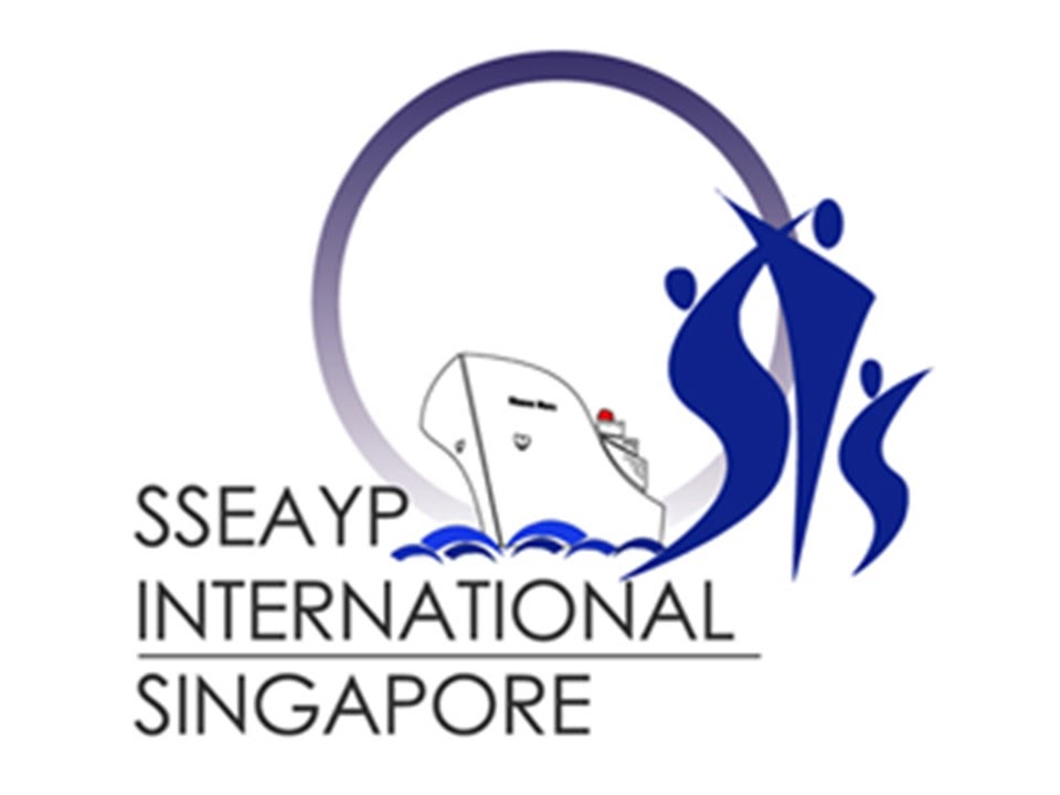
The logo combines sharp edges and curves, as part of the multi-faceted approach of the SSEAYP in engendering closer ties and understanding among the youths of Southeast Asia and Japan.
The circle surrounding the figures in the center encapsulates the unity and solidarity that the SSEAYP hopes to bring, anchoring the youths from diverse backgrounds into the larger family of regional harmony and co-operation where they learn, exchange and build bridges into one another’s world.
The three figures pivoted at the center of the logo emphasize that youths are at the center of this programme and they point to a better future ahead with clarity and vision. Together they form the letters SIS, which stands of SSEAYP International Singapore.
The logo is in shades of blue; a color that spells the bright hopes that lie in our youth as well as the sea of friendship that the ship will be steering in.
The logo was designed by Ng Kim Hwee, SPY 1988.


